"That Sucks": Negative Feedback after Launch
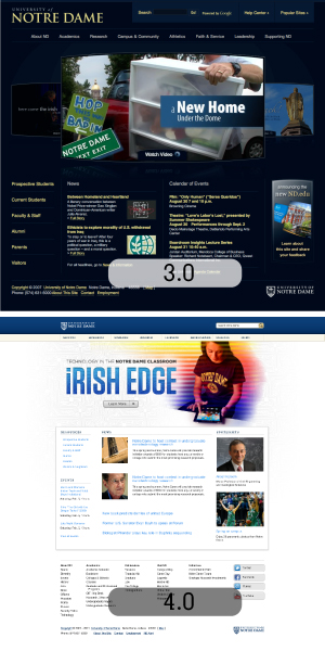
On July 1, we launched ND.edu 4.0. This was a new look and feel for the site, as well as a conceptually different approach to the homepage and navigation. But the biggest change was a fundamental shift in who our audiences were. I’ll elaborate on these later, but that’s not the point of this post. The point? Every time we make a major change to the design of the ND.edu homepage, we get feedback. And it’s overwhelmingly negative.
Back in August 2007, when we launched the ND.edu with the Flash carousel, we were really proud of it. But people were surprised by the new site. The old site had been up for about eight years, and it wasn’t a very effective tool for us. To many of our visitors, though, they knew the old site. They could find what they needed and they were accustomed to it. The new site changed a lot, including navigation and content. Suddenly, people were shocked and their business was disrupted. (The site also launched on the first day of classes, which made matters even worse.)
To my group, that’s ancient history. We’ve learned our lessons and moved on. So when we came up on our July 1 launch goal, we knew we needed to address it differently.
As I mentioned earlier, the new site had a new approach to our audiences. Most notably, we knew that our internal audiences (faculty, staff, and students) represented a high proportion of our traffic. Other internally-focused online tools weren’t meeting their needs so they went to ND.edu to do their business. This diluted the main website because it had to address that many more audiences. Language, resources, navigation – all had to accommodate a wider range of users.
The Feedback
We prepared our internal audiences over the course of several months with a series of emails, articles, and meetings. The new internal tool was launched a month before the new ND.edu. There was time for transition.
When we launched, the feedback came flooding in. For a site that gets somewhere around 500k visits per month on the low end, we expected a quick response. “I think it’s just ugly” and “How could you do this????” were tame responses. Some 75% of the responses were negative.
After further analysis, it was clear that the vast majority of the negative responses were internal users who didn’t like the change to their usage patterns. They didn’t like having to go somewhere else. But it was satisfying to see comments like “now I’m going to change my homepage to inside.nd.edu” because that was the whole point.
Lessons Learned (good and bad)
Knowing our strategy meant being firm in our decisions. We didn’t waver when we felt the pressure on moving internal users out. We were right and we stuck to our guns.
Listen to feedback and respond to each one. One of our team members personally replied to every email we got. Sometimes it was a generic “thanks” but most of the time it was to direct the user to the new location, answer a quick question, or take the suggestion and report back to the team. One major issue we discovered was with the new internal resource – people still struggled. Within hours, it was fixed and the complaints about that issue went away.
Roll out early and you’ll have more time to anticipate the real issues. We didn’t publicize the change as early as we could have, and I think that meant there were many users who didn’t get hit with our rollout plan. Instead of dealing with the real issues, we had to wade through feedback about changes that should have been communicated.
Anticipate and prepare for the feedback you’ll get. We met and brainstormed all the complaints we might get, and developed responses to them. This exercise forced us to think hard about our decisions and was highly beneficial. We compiled our preemptive FAQ and we shared it with our bosses so they were armed to defend the site as well.

Celebrate your accomplishment. Our whole team came back to the office after dinner and we had a launch party. Some spouses joined us and we listened to music, played video games, and generally joked around a bunch. Once the site was live, we did QA testing and watched the initial feedback. Oh, and we TPed our boss’s office just before he came in to join the party.
5 Comments
Eric Olsen — August 17, 2011
Love the honesty. It’s so helpful understanding other’s pain points as we look forward to our next launch! Huge congratulations!
Chas Grundy — August 17, 2011
Thanks for the comments, all.
@Dan – summer was a strategic choice indeed, especially since our previous relaunch was on the first day of classes. Nothing raises the ire of your internal audiences as throwing them a knuckleball when they’re most slammed.
Dan Woychick — August 17, 2011
Chas:
Congrats on the launch of the new site – your overwhelmingly negative feedback is not surprising based on my experience in similar situations. Your plan to prepare for and respond to these users’ comments would be a good model for any institution to follow.
I’m a firm believer in separating the internal and external users as you’ve done, and am surprised how few universities do this. I also think it was wise to launch in the middle of summer.
Keep up the good work!
Michaelbrazell — August 17, 2011
Caught your entry off of BlogHighEd and sympathize with your team. For what it’s worth, I like the new ND.edu. I am not going to offer any “constructive criticism” or anything because whenever a web developer/designer pulls open a would-be colleague’s website, he initially looks for something to critique, and I think that it’s bogus of us. So, I like it all.
I also really sympathize with the reaction that you got with this website and any past attempts to re-design. We had a pretty major re-design at the small Catholic Liberal Arts college that I develop for back in 2008, and it was a big positive change in many ways, but, here I was working my tail off to get a new design implemented… One that we had labored as a campus over for months, and it was approaching the final hours, and I had been sleepless and overworked for days, and I considered it “done.” I went home and celebrated by sleeping. I came to work the next day with a litany of emails, my friends congratulating us and being proud of the new site, but other employees — faculty, some administration — simply ripping everything to shreds, criticizing everything, and at least one in particular claiming that I was some rogue designer set on upending the academic rigor of our school and “harm his students.” I have a fairly thick skin, but needless to say, I took the criticisms, but they privately brought me to tears.
Web design at an academic institution has a set of particular challenges unique to higher ed. For one, with web design, because everybody uses the internet, people who browse websites all day think that how they browse is how everybody browses, and therefore, how everybody should browse. Everybody drives a car to work, but only few people think that they know more about constructing and designing a car than their car manufacturer. If only it were so easy for us. And, for Higher ed, it is unique because not only are we designing something where everybody thinks that they are the expert, but on top of that, in academia, everybody is an expert; these folks are the brightest in the world when it comes to their field, they are exceptionally loquatious and having spent over a decade in advanced studies themselves, they can argue like the best lawyers in the world.
Working in higher education can be a blessing, and I love my job, but there are times when it just drives you mad.
Best of luck with the roll out and future implementations.
John Barley — February 08, 2012
Aw it was good while it lasted!