Emergencies and Your Web Design
After a major campus crisis, schools often respond by scrambling to put together a crisis plan. Often this stops with a “business continuity plan,” or how they’ll keep things going despite a crisis. At Notre Dame, my colleague Julie Flory helped establish a Crisis Communications Plan – how we’ll communicate during and after a crisis. As part of this planning, my team developed a approach for handling the ND.edu homepage in a crisis situation.
The Problem
As the folks at Virginia Tech learned in 2007, a crisis means increased traffic. Their website crashed under the strain of millions of visits due to national media exposure, including concerned parents and friends. Their image- and code-heavy homepage (as most of our higher ed homepages are) required a lot of resources to push out to those millions.
As Karine Joly documents on CollegeWebEditor.com, Virginia Tech ended up using a series of crisis pages and templates they used throughout the tragedy. Some of this was on-the-fly reaction to the unexpected strain. Our goal at Notre Dame was to create solutions to use based on the level of demand so we wouldn’t have to invent a solution during a crisis.
Level One: Local and Internal
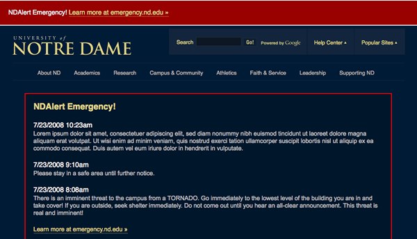
During a “Level 1” emergency, locally relevant information or announcements (i.e., a test of our NDAlert system) will display above the carousel on nd.edu and emergency.nd.edu. This is similar in style and approach as a “Breaking News” bar at the top of the CNN.com website. It allows local, affected constituents to be aware of the alert, but it does not significantly alter the experience for outside audiences who are not affected.
During a “Level 1” emergency, the red banner will appear on nd.edu homepage, sub-pages and all audience pages. This will make the emergency message site-wide (though not all ND sites). It will include a text link to the emergency website.
ND.edu during Level One

Level Two: Local but Critical
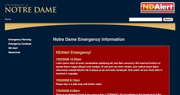
During a locally relevant emergency (e.g., a tornado warning), the carousel is replaced on the homepage and all audience pages with a pre-designed emergency block with relevant emergency text. This allows us to push critical information to our local visitors. This text is mirrored on emergency.nd.edu, our official destination for Crisis Communications.
ND.edu during Level Two

Level Three: Full Blown Crisis Mode
A major emergency is likely to draw significant external traffic to ND.edu. To avoid a server crash which might keep visitors from getting important information, all traffic to the ND.edu homepage and subpages redirect to our Emergency.nd.edu site. The Emergency site is a site designed to keep the focus on the critical information.
Emergency.nd.edu during Level Three

Level Four: Clarity Through Minimalism
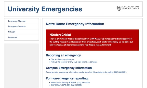
Even though emergency.nd.edu is a relatively simple page, it does include a little more design and page weight. National media attention would drive a lot of traffic to the site, and in that case it could potentially bring the server down. In this level, we would redirect all traffic to a special, lightweight version of emergency.nd.edu. This version of the page is identical to the current emergency.nd.edu in all but style.
We’ve never used this, and hopefully we never will.
Emergency.nd.edu during Level Four

Crisis Communications beyond the website
In a crisis, our communications team leader would determine which version to use and what messages go up. But those messages also go out to a number of other places – our campus alert system sends text messages, automated phone calls, in-building campus PA systems, etc. We also push the updates out to Facebook, Twitter, and the campus email lists. In a crisis, it’s important to ensure that those who need to receive the message do.
In the handful of situations we’ve had to use this (a small fire, tornado warning, etc.) we found that this provided the flexibility to change the website without having to invent a new solution on the fly. After all, when you’re in the middle of a crisis you need your people working efficiently.
2 Comments
Tom — November 19, 2010
A very nice overview of how we communicate during emergencies. What’s especially relevant is the multimodal approach, there are many layers.
Francesca — December 02, 2011
Just wanna state that this is very useful , Thanks for taking your time to write this.