Smarter IA Naming by Reducing Cognitive Load
One of the frequent debates in web projects is around naming of elements. When our team recommends a label or title we usually do so from an outsider’s perspective. We make a lot of arguments for our position, but sometimes there’s resistance.
So we do some user testing. Usually, it’s clear that one option is far superior to another, and that settles the argument. But for some reason, this isn’t always enough.
So we have to explain why we got that outcome. Let’s don our psychologist hat for a moment.
Cognitive Load is refers to the demands placed on working memory. Your working memory is typically limited to approximately seven elements (hence the seven digit phone number and so on).
I believe that cognitive load is strongly tied to user experience and information architecture. If users have a working memory limit of approximately seven items, how can you justify twelve global navigation options?
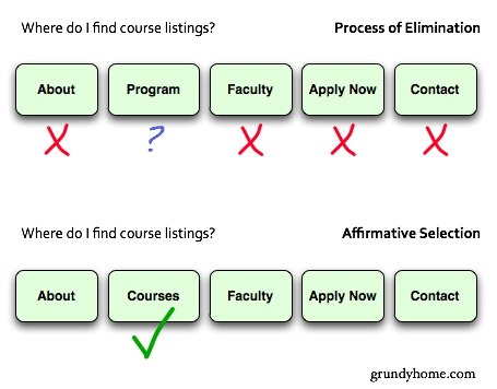
How does this explain naming choices? The cognitive load increases when there are more interactions between elements. Imagine a visitor to a department website looking for course descriptions. She quickly skims through each navigation item hoping to find one that matches what she’s looking for.

Option 1: Process of Elimination
Unfortunately, she doesn’t immediately recognize that Program might contain course descriptions. She rules it out, or at best decides it’s on the short list. However, after looking through all the options she’s still not sure where it is. So she eliminates the other choices before deciding it’s probably under Program.
Option 2: Affirmative Selection
A clearly named item encourages visitors to immediately select that item rather than consult all other options. It’s been observed that "users take the lazy route ":http://www.useit.com/alertbox/20030630.html and do not like to read every word. If at all possible, reduce the number of navigation items and name them clearly. This is fundamental to information architecture work.
Cognitive Load
If cognitive load is connected to user experience (though there are opinions to the contrary), I believe it is most easily seen in the user’s frustration level. One study of working memory and choice observed that, as working memory is taxed, people begin to rely on emotional decision-making rather than rational thought. In short, someone who is trying to recall seven random digits is more likely to make emotional, often irrational choices. Does your website unintentionally push people to emotional decisions about where they even navigate?
3 Comments
FridrihLop — May 29, 2009
Good article, the advertisment is sold?
FokusLop — May 30, 2009
Good article, Thanks. my name Philip.
drew — May 20, 2009
trumping all this scholarly activity is the homepage search bar. Or maybe people rely on search when the navigation is ill-conceived.