The How, What, and Why of Mobile in Higher Ed
The How of Mobile
Mobile development in 30 seconds:
Schools create separate websites for mobile access. Some schools use special stylesheets on the same content. MIT establishes a platform-specific approach to serving content to mobile devices. Stanford students create an iPhone app suite for Stanford and then launch a company to do it for other schools. Duke becomes one of their customers.
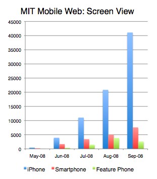
Following the lead of MIT’s Mobile Web architecture, we can lump nearly all mobile devices into three categories: iPhone, Smartphone, Feature (i.e., legacy phones that have a web feature). The logic goes that these devices have different capabilities and interfaces, so they should get a different presentation. And according to MIT’s stats, the iPhone is taking over in a big way.
Fortunately, MIT is planning to open source their code very soon. The challenges of detection, routing, and delivery will be even easier to overcome and we can focus on what to mobilize.
The What of Mobile
Just because you can speak the mobile language doesn’t mean you’re saying anything intelligent. For many organizations, mobile is just another delivery mechanism for the same old content. Unfortunately, the content we do produce isn’t always that great.
It’s not enough to simply make websites mobile-friendly. Not every single thing you would do on your full-featured web browser is worth doing on your phone. Is your phone ideal for research? Writing lengthy blog posts? Registering for courses?
Think mobile – what do you want to do on your mobile device? If you’re walking across campus, sitting in a meeting, or wherever you might use your cell phone, what do you need to do?
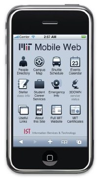
Some common tools:
- Directory lookup – phone numbers, addresses
- Campus Map
- Emergency info
- Events
- News (especially athletics scores)
But what about student-specific info like class schedules or computer lab availability? Visitors to campus might want to know the best route from one building to another. Or campus transportation schedules?
To answer the what, we need to think about the why of mobile.
The Why of Mobile
As with any project, it helps to consider your audiences, their goals, and the reasons behind them. Prospective students have mobile devices, but is that how they research schools to apply to? Fortunately, it’s not too hard to use the typical tools to measure these things and gauge why your mobile users are coming to your site. (Aside: Not all mobile devices have Javascript support, so you should be careful about limiting your measurement to a JS-only tool.)
From a communications perspective, it also helps to consider your goals. Reduce calls to your call center or help desk. Deliver messages to users who need them the most (desperately searching for something). Increase awareness of events or news. And so on.
The Future of Mobile
For the time being, mobile is still just a limited replacement for a laptop or desktop computer. As that changes (with the technology, access areas, and speed), so will the use cases for mobile. Pew Internet predicts that the “mobile device will be the primary connection tool to the internet for most people in the world in 2020.” We’re already seeing this in Japan and China, where mobile connectivity is more affordable and more ubiquitous than traditional broadband connections.

Imagine students who don’t carry their IDs because the dining hall or library can scan a barcode off their phone? Or taking a photo of a QR code to get bibliographic data? These aren’t exactly the future – they’re already being done.
Mobile is more than just throwing together a mobile stylesheet or an iPhone app. It’s a culture of users who want certain content on-demand, on-the-go, and in a format that suits them. With MIT and iStanford, the answer was to bundle commonly used tools into a mobile-friendly suite. But the edges of theses suites often leave something to be desired as well—browse outside of the usual sites and the mobile experience falls apart.