Finding the Best Event Calendar Interface
I hate calendars. They’re home to some of the worst software I’ve used. One of the worst things about them is the complete disregard for interface and usability.
The first, and most obvious, goal of a calendar is for people to find an event. Whether they know of the event or are just browsing, finding an event is the most basic task. So let’s look at some main options that I’ve used or implemented.
30 Boxes / Wall Calendar
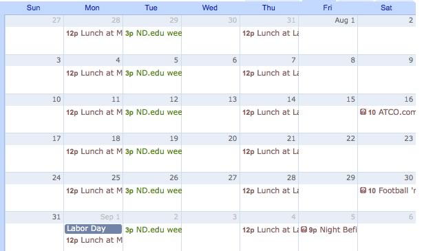
If you have a lot of events, this view makes it hard to fit the information. If you don’t have a lot of events, there’s a lot of wasted room. Or the boxes distort to show the events you do have. The wall calendar view makes sense for one thing: giving you a quick view of what dates fall on what days. This is the worst of all event calendar interfaces. But having built and implemented many calendars for many client websites, I refuse to do this for most projects.
List
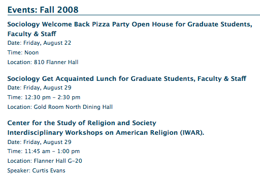
The list is a very basic approach: show the events in order by date. These are more of a headline style, with some or all event details broken out. This works well for very few events, but is a cognitive nightmare when there are hundreds of events.
Weekly / Date Range
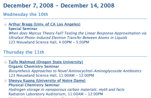
This is a version of the list view, but pared down to a specific date range such as a week. If the user knows when the event is happening, this can reduce the cognitive load by cutting down to a handful of events. However, this can also produce results with too many or even no events at all – both of which defeat the purpose.
Agenda
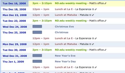
The agenda approach displays a list of events in order by date, with the date displayed prominently. Makes sense, right? It makes it easier to find events you need quickly, with enough info to catch your attention but also find specific events without parsing a lot of descriptive text.
Tools and Trick to Make it Better
Category Filter
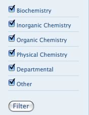
The filter is a great way of breaking down events by category. This is even better when it gives the option of subscribing to a specific calendar (if you’re into that kind of thing).
Date Picker
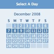
The picker view is a throwback to the wall calendar, but with the benefit of cramming it into a much smaller space. Bonus points if the only days with events are the only ones you can select. In this example, the whole week is highlighted because it’s used in combination with the weekly date range approach. Note how the dates are all the same – only one of those weeks has any events, and it’s not even the one that’s highlighted. A great use of a date picker is to quickly move past many months or years to find events in a specific date range.
Question: What’s the Best Calendar Interface?
Answer: The one that’s best for your content. Too many events or too few and any of these options are terrible. But combined with a category filter and a date picker, and most of these can be usable. I always liked how Google Calendar gives me several options, rather than forcing me to wade through a wall calendar or scroll past hundreds in a list to find the one I want.
1 Comment
Laurel — December 23, 2008
Chas, This is exactly what I needed, exactly when I needed.