Don't Listen to Designers
Yesterday, our team debated the right UX approach to a search field. Should the button say “Search?” Or is it ok to say “Go?” Text in the field or not? A separate label or no?
I searched online for definitive study results, but got nothing substantial. What I found, however, troubled me: recommendations, apparently based on intuition.
A lot of designers (just like the rest of us, of course), work hard to become experts in their fields. They study, they observe, they practice, and they learn from their mistakes. But just like anyone, they are subject to biases and personal experiences that may or may not apply to others. And just like anyone, they aren’t always right.
What I wanted to find out there was a report from a comprehensive usability study, results from informal testing, or at least some quick research that indicated whether “Search” or “Go” really mattered.
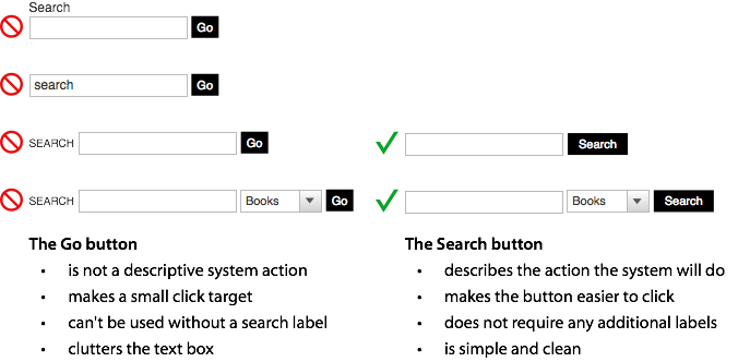
This article from UX Movement, which came out yesterday (which is, I admit, perfect timing for our discussion), is a great example. The article is well-articulated and sounds perfectly logical, but in my experience with testing our intuition and logic don’t always align with the test results. That’s why we do testing.
Plus, the article approaches the problem from a design standpoint and misses a critical issue: accessibility. One of the commenters, Zeke Franco, calls attention to this:
I agree that buttons/submit inputs with the text “go” are small and not very descripÂtive. But every form input should have a label in the HTML for accessibility reasons.
Non-sighted user [sic] preÂfer the label eleÂment because it reads the label to them in relaÂtion to the field first.
This oversight is the product of an intelligent designer thinking about a design issue. The risk is taking the recommendation at his word and failing to consider the other elements, such as accessibility or compatibility.
Okay, Listen to Designers
Great designers won’t just tell you what’s right and wrong, they’ll convince you. They’ll challenge their own assumptions and intuitions, experiment, and test. In the end, they’ll be better for it. Bonus: You’ll trust their subjective opinions (because aren’t you paying designers for their subjective opinions, too?) even more.
Developing a brief but effective test isn’t that hard to do and it should help you argue your case much better in front of a client or your boss. And besides – wouldn’t you want to know you’re right rather than guess you are?
3 Comments
Chad — September 21, 2010
Although I agree with pretty much everything that is being said here, one could still use a label to give contextual cue for accessibility purposes. By setting visibility to hidden on that label would make the label not show up but would not remove it from the page. A screen reader will still be able to detect this information despite it not being visibly shown.
Don Schindler — September 21, 2010
Great article and I love how did some research about our meeting yesterday. Good stuff.
Iza Bartosiewicz — September 23, 2010
Chas, I agree with you, and I was glad that I wasn’t the only one raising accessibility as an issue in the discussion following the UX Movement article. Every time I see an article that claims to offer the best, ‘one size fits all’ design/ux solution, my alarm bells go off. Everyone is free to publish their opinions, but we have to be more critical about what we read and be able to tell the difference between personal opinions vs carefully researched conclusions. Unfortunately, many people are willing to run with someone’s ‘you should do this or that’ blanket advice, particularly when it also agrees with their opinions or preferences. So, thanks for your thoughtful article, it deserves to be shared.
@Chad, Gez Lemon researched the different ways of hiding the label and presented his findings in this article: http://juicystudio.com/article/invisible-form-prompts.php
He concluded that the best method is to use title attribute on form control, which is what now WCAG 2.0 recommends:
H65: Using the title attribute to idenÂtify form conÂtrols when the label eleÂment canÂnot be used (HTML) http://www.w3.org/TR/2008/WD-WCAG20-TECHS-20080430/H65.html