3 Email Marketing Failures, Illustrated Edition
EMAIL FAIL: Nothing but images.
This gigantic email was made up of one piece of content: a giant image. Like so many users, the default view didn’t show me this image because images are turned off by default (in both of my email clients: in Entourage and in Gmail).
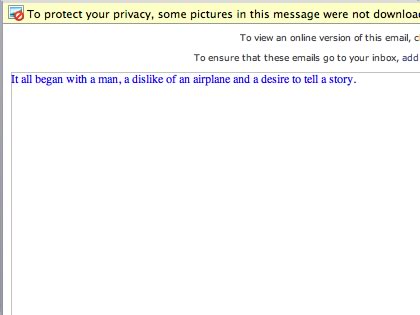
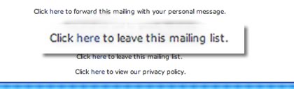
The footer text had their contact info and a couple of links, but I only scrolled down for one reason: to unsubscribe.
Tip: Build your email as if nobody will see your images. Then use images to make the email really pop. A great example is this Christmas card email, where all of the copy is live web text.
EMAIL FAIL: Pretending to get personal.
Personalization has been used in direct mail for a long time and it can be tremendously effective. Except when you screw it up. I found this one ironic.
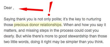
Sorry, but while the marketer is extolling the virtues of nurturing relationships, they managed to mess up the personalization side of things. This is an easy mail merge feature to use in most email marketing software, but every one I’ve used has an option to handle empty fields. In other words, it can provide a fallback in case there’s no name to include. Personalization only works if it’s perceived to be personal – not a form letter with your name plastered at the top. As the above email goes on to say, “missing steps in the process could cost you dearly.”
Tip: Personalize names and subject lines, but don’t stop there. But make it work even if you don’t have a name. Have a fallback. And the best personalization is sincere – it doesn’t sound contrived.
EMAIL FAIL: Nothing but text.
Ok, I’ll pick on myself now. A couple of years back, as we were starting to really use email marketing for Camp Tannadoonah, we sent this email to a group of camper parents. The goal was to bring them together and build a word-of-mouth program. While the program was a good one, the execution was poor. And that started with the introductory email we sent out:
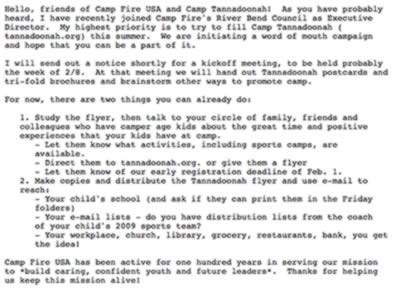
No clear call-to-action. Way too much text. No images or headers to grab attention. Vague goals and concept. No unsubscribe. And it was sent through desktop email software, so it wasn’t measurable.
After our first meeting (terrible attendance) we got feedback that people didn’t understand and that they didn’t even know about the meeting. Any wonder why?
Today, our emails are far more effective (we know because we measure them).
Tip: Slow down and look at emails you receive and think about what made you open them in the first place. Which ones make you read more, or take action? As marketers, we often forget that we’re customers, too. If it annoys you, how do you think your recipients feel?