Breaking the Law: The 3 Click Rule
Jakob Nielsen has introduced a lot of helpful guidelines and research for the web industry. But as the industry shifts, the many of these guidelines should shift as well. But people remember these slogans. And they repeat them for years, unaware of new research or trends. (See Where the Fold Exists)
At one point, a record exec passed on The Beatles because guitar-based music was on its way out. That’s what I think of when someone tells me the website shouldn’t scroll.
Three Clicks
One of Nielsen’s guidelines, so often repeated, is that any content should be available within three clicks. A lot of my clients seem to know this “rule” and bring it up during information architecture or design meetings.
Some clients end up with a site structure that looks like this:
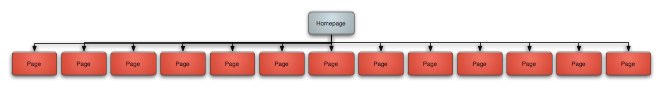
Wide and flat. Clients think it works because a user can get to any page on the site from any other page on the site.
This doesn’t work because visitors have to parse too many options, too quickly. As soon as they find a potential match, they go to that page. Then they’ll need to do the same thing again. I recommend 4-6 top level navigation choices.
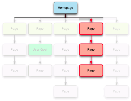
But having too narrow and deep of a site can be equally frustrating, because there’s too much interaction required for each decision. Suddenly it’s 10 clicks to wind down into the page that could be easier to find and get to. For very large sites, finding this kind of balance is one of the hardest parts of a project.
What’s Behind the Rule
The three click rule is an excuse for lazy content organization: as long as it’s within three clicks, it must be usable. Or so some of my clients would have you believe.
The point that Nielsen has started making, is that it’s not important how many clicks as it is how productive those clicks are. He recently wrote about interaction elasticity, or how “usage goes down as interaction costs increase.”
I consider cognitive load to be part of these interaction costs, certainly more than the physical cost of having to click one more time. Harvard College Library has a very simple, but effective interface to navigate into the site. With four main choices, you quickly eliminate 75% of the pages on your way to finding what you want.
A New “Rule”
A more flexible approach to the classic rule is my 1 Click Rule:
Every click or interaction should take the user closer to their goal while eliminating as much of the non-destination as possible.
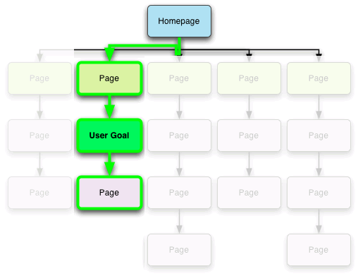
The corollary:
Avoid any interaction that eliminates the user’s intended goal.
Just remember, not every visit starts with your homepage; this process should be reliable from any point in the site, easily navigable back to your homepage or another section of your site.
3 Comments
Zavrina — December 14, 2011
It’s worndeful to have you on our side, haha!
loans online — August 09, 2012
instant
Himanshu Vyas — December 29, 2012
The Article made my head clean about “3 Click rule”, I was confused about it but it’s giving chance to think more about it. Thanks for sharing